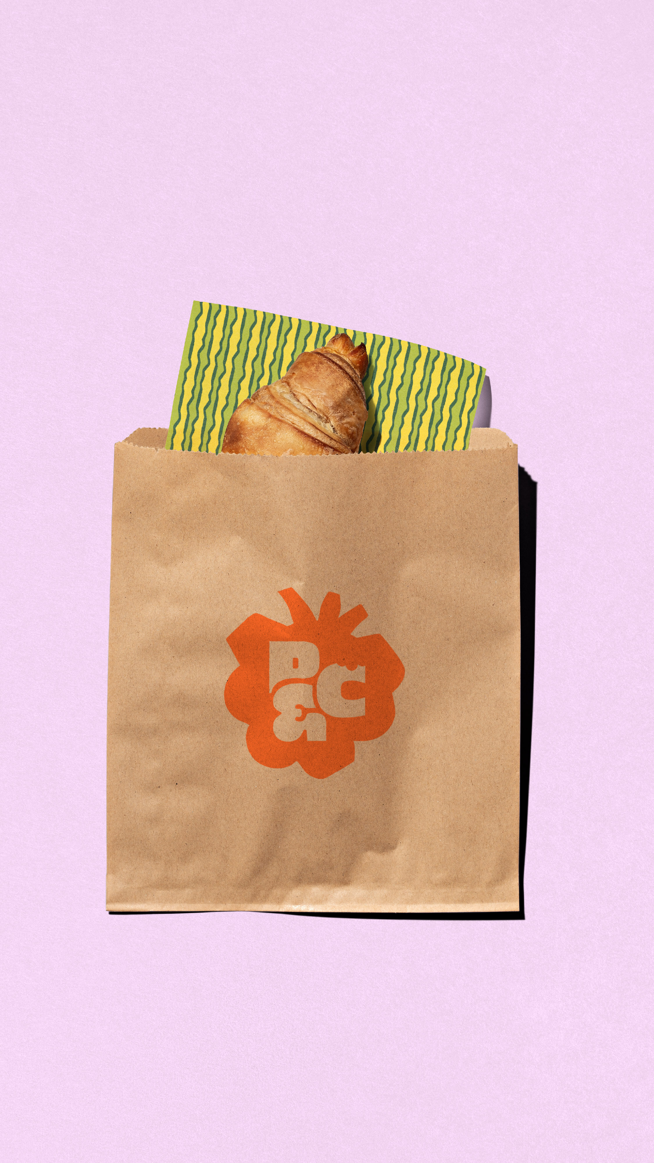
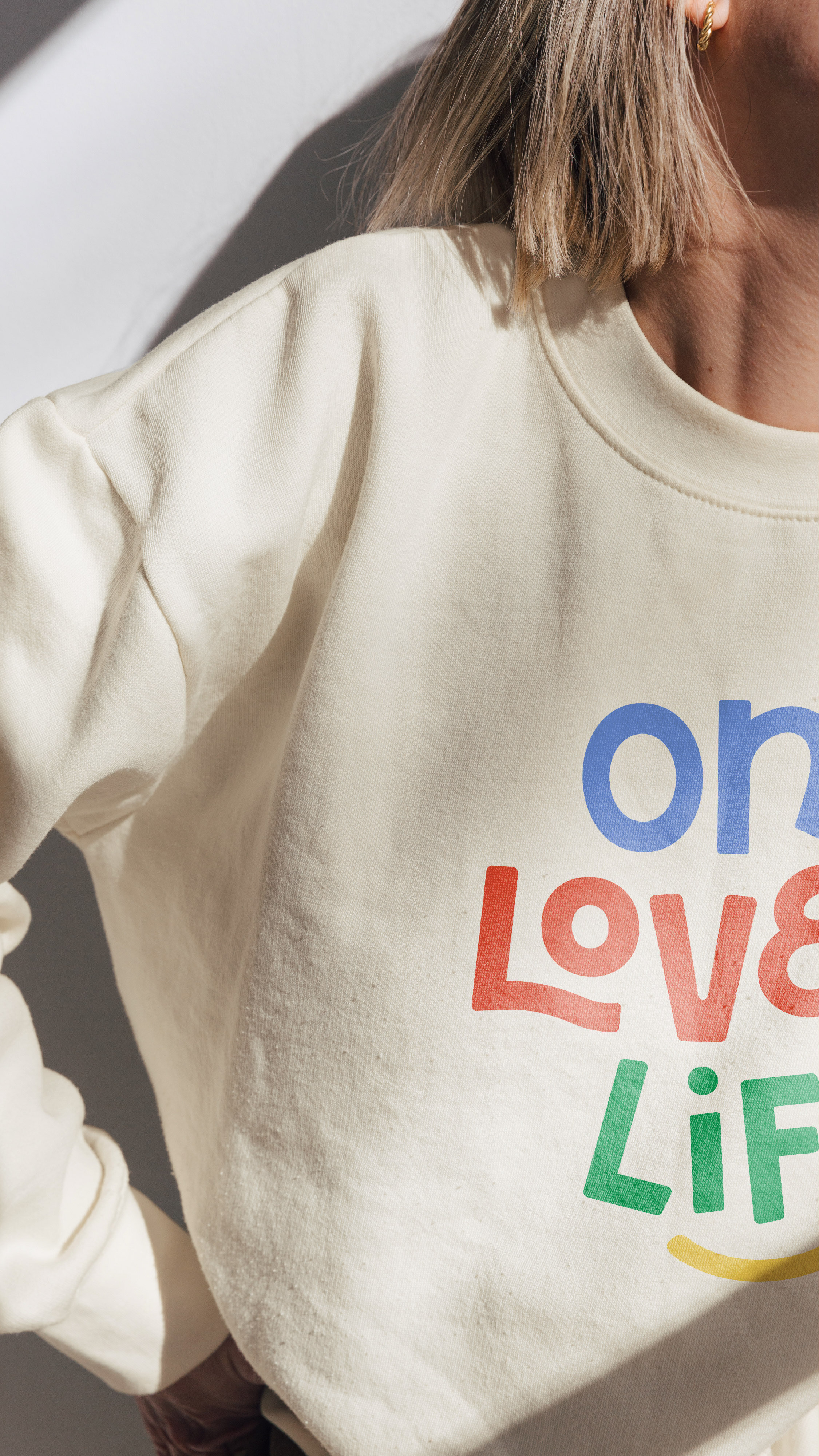
Meal prep made fun! Houston-based Pump & Crunch came to us seeking a brand that felt as fresh, energetic, and craveable as the food itself. We leaned into bold color, playful typography, custom iconography, and personality-filled details to create a more ownable visual identity across packaging, collateral, and every customer touchpoint.
Custom Brand
Scope
Pump
& Crunch


Energizing / Warm / Intentional
Vibrant / Empowering / Bold
Brand Adjectives


"I am obsessed with our branding. It feels like me, but elevated — like Pump & Crunch finally put on its grown-up, powerful, confident outfit while still keeping its heart. It’s bold, clean, fun, and totally aligned with the energy we bring to everything we do. From packaging to social to the website to in-store experience, everything finally feels cohesive and intentional.
Kelsea truly gets founders. She listened deeply, pulled the vision out of my brain, and somehow turned it into something even better than I imagined. I felt seen, heard, and creatively supported every step of the way."